ICICI Lombard · Product Experience
Homepage
Transformation.
Homepage
Transformation.
A leadership story about turning a business challenge into a clearer customer experience — from business question to design principle.
A leadership story about turning a business challenge into a clearer customer experience — from business question to design principle.
A leadership story about turning a business challenge into a clearer customer experience — from business question to design principle.
Role Design leadership
Focus Organic V2Q
Scope Homepage + quote entry

*SHIPPED PRODUCT · HISTORICAL CASE STUDY
*SHIPPED PRODUCT · HISTORICAL CASE STUDY
Improved UX
Improved UX
Increase in organic V2Q
Upfront Inputs
Upfront Inputs
Higher engagement with key products
Lower
Lower
Friction in the quote journey
01 · The context
A homepage that had to pull more weight.
A homepage that had to pull more weight.
Paid acquisition was getting expensive. Product, Marketing and Design were asked to make the homepage convert more visitors into quotes — without losing trust, compliance or brand clarity.
Paid acquisition was getting expensive. Product, Marketing and Design were asked to make the homepage convert more visitors into quotes — without losing trust, compliance or brand clarity.
Paid acquisition was getting expensive. Product, Marketing and Design were asked to make the homepage convert more visitors into quotes — without losing trust, compliance or brand clarity.
01
01
The business challenge
The existing homepage had grown incrementally over the years: a campaign here, a compliance line there. Every addition made sense alone, but the page no longer worked as one coherent experience. This was not a “make it prettier” assignment. It was about making the homepage work harder for the business.
Customer context
In India, people comfortably buy phones, televisions and even gold online — but insurance remains a financial commitment tied to trust, advice and reassurance.
How might we build enough confidence to start digitally, while recognising that many customers still seek reassurance?
02 · My role
Clarity before screens.
Clarity before screens.
My contribution was less about personally drawing every interface and more about framing the right problem, setting direction and helping the team make better decisions together.
My contribution was less about personally drawing every interface and more about framing the right problem, setting direction and helping the team make better decisions together.
My contribution was less about personally drawing every interface and more about framing the right problem, setting direction and helping the team make better decisions together.
Clarity before screens
Translated business requirements into clear design objectives and established the overall UX direction.
01 · Strategy
Clarity before screens
Translated business requirements into clear design objectives and established the overall UX direction.
01 · Strategy
Healthy debate
Encouraged multiple ideas before decisions, guiding reviews, critique and iterations.
02 · Leadership
Healthy debate
Encouraged multiple ideas before decisions, guiding reviews, critique and iterations.
02 · Leadership
Balancing constraints
Balanced customer experience, branding, compliance and technical realities throughout the work.
03 · Management
Balancing constraints
Balanced customer experience, branding, compliance and technical realities throughout the work.
03 · Management
The right questions
This was not about having every answer — it was about helping the team ask better questions.
04 · Direction
The right questions
This was not about having every answer — it was about helping the team ask better questions.
04 · Direction
03 · What we discovered
The page spoke about the organisation, not the customer’s next action.
The page spoke about the organisation, not the customer’s next action.
The redesign began by identifying where the existing experience created search, hesitation and competing priorities.
The redesign began by identifying where the existing experience created search, hesitation and competing priorities.
The redesign began by identifying where the existing experience created search, hesitation and competing priorities.
01
Brand-focused, not action-focused
The homepage communicated the organisation rather than guiding customers towards a useful next step.
01
Brand-focused, not action-focused
The homepage communicated the organisation rather than guiding customers towards a useful next step.
02
Products required searching
Customers had to explore the page to locate products instead of being guided towards them immediately.
02
Products required searching
Customers had to explore the page to locate products instead of being guided towards them immediately.
03
No clear primary action
The quote journey — the most important conversion action — was not clearly visible above the fold.
03
No clear primary action
The quote journey — the most important conversion action — was not clearly visible above the fold.
04
Competing information
Campaigns, products and compliance messages competed for attention rather than supporting decisions.
04
Competing information
Campaigns, products and compliance messages competed for attention rather than supporting decisions.
What was going through my mind
A customer does not visit an insurance homepage to admire it. They come to buy, renew or intimate a claim.
A customer does not visit an insurance homepage to admire it. They come to buy, renew or intimate a claim.
A customer does not visit an insurance homepage to admire it. They come to buy, renew or intimate a claim.
Help them do those things faster and we create a better business outcome — not merely a better-looking homepage. That thought, reinforced by my own experience of buying health insurance for my family, became the guiding light behind the design decisions.
Help them do those things faster and we create a better business outcome — not merely a better-looking homepage. That thought, reinforced by my own experience of buying health insurance for my family, became the guiding light behind the design decisions.
Help them do those things faster and we create a better business outcome — not merely a better-looking homepage. That thought, reinforced by my own experience of buying health insurance for my family, became the guiding light behind the design decisions.
04 · Design principles
Simple rules that kept the experience focused.
Simple rules that kept the experience focused.
The principles gave Product, Marketing, Engineering and Design a shared lens for evaluating every addition to the page.
The principles gave Product, Marketing, Engineering and Design a shared lens for evaluating every addition to the page.
The principles gave Product, Marketing, Engineering and Design a shared lens for evaluating every addition to the page.
01
Make it easy to start
Bring key customer actions closer to the first viewport.
01
Make it easy to start
Bring key customer actions closer to the first viewport.
02
Reduce unnecessary decisions
Use clear priorities instead of asking customers to interpret everything.
02
Reduce unnecessary decisions
Use clear priorities instead of asking customers to interpret everything.
03
Organise around intent
Make products discoverable through the tasks customers came to complete.
03
Organise around intent
Make products discoverable through the tasks customers came to complete.
04
Build trust into the journey
Use service commitments, support and proof at the point of decision.
04
Build trust into the journey
Use service commitments, support and proof at the point of decision.
05
Balance business and customer
Protect conversion without ignoring campaigns, products or compliance.
05
Balance business and customer
Protect conversion without ignoring campaigns, products or compliance.
06
Design for future change
Create a modular homepage that can evolve without losing hierarchy.
06
Design for future change
Create a modular homepage that can evolve without losing hierarchy.
05 · The transformation
Same business. Clearer priorities.
Same business. Clearer priorities.
Drag across the image to compare the legacy experience with the redesigned first fold.
Drag across the image to compare the legacy experience with the redesigned first fold.
Drag across the image to compare the legacy experience with the redesigned first fold.


06 · What changed
The biggest improvements happened above the fold.
The biggest improvements happened above the fold.
Instead of adding more content, the redesign made product discovery, quote initiation, compliance and trust easier to understand.
Instead of adding more content, the redesign made product discovery, quote initiation, compliance and trust easier to understand.
Instead of adding more content, the redesign made product discovery, quote initiation, compliance and trust easier to understand.

Product selection on the first fold
Customers could see and choose key insurance products immediately, without hunting through navigation.
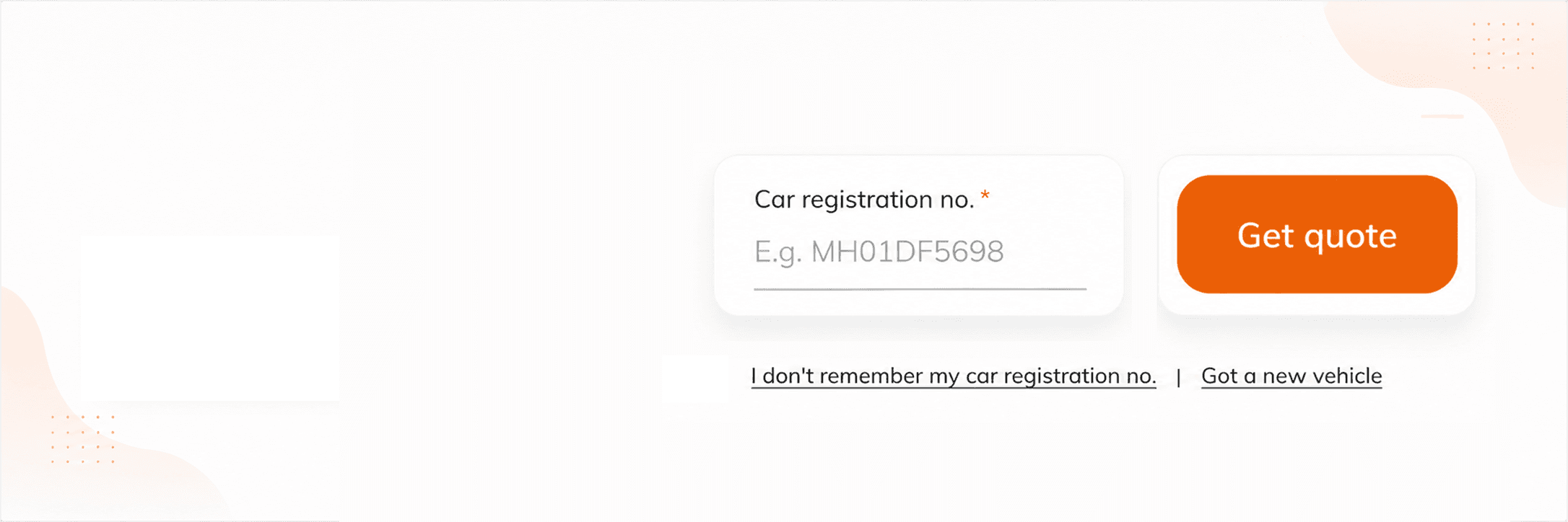
Opened up the quote journey
Quote initiation became an integral part of the homepage rather than a separate step hidden behind a product page.

Compliance made discoverable
Important announcements and timely product communication became easier to find without overtaking the core journey.

Trust made visible
Service commitments and proof points were presented clearly, informed by service-survey feedback and customer concerns.
07 · Outcomes
Better decisions. Better outcomes.
Better decisions. Better outcomes.
When business, product, engineering and design worked towards the same objective, the homepage became simpler for customers and more valuable for the business.
When business, product, engineering and design worked towards the same objective, the homepage became simpler for customers and more valuable for the business.
When business, product, engineering and design worked towards the same objective, the homepage became simpler for customers and more valuable for the business.
40%
40%
Increase in organic V2Q
The homepage generated more quote intent from organic visitors.
The homepage generated more quote intent from organic visitors.
40%
Increase in organic V2Q
The homepage generated more quote intent from organic visitors.
Higher
Higher
Product engagement
Key products became visible and easier to begin exploring.
Key products became visible and easier to begin exploring.
Higher
Product engagement
Key products became visible and easier to begin exploring.
Lower
Lower
Quote friction
The journey began sooner with clearer choices and fewer detours.
The journey began sooner with clearer choices and fewer detours.
Lower
Quote friction
The journey began sooner with clearer choices and fewer detours.
Stronger
Stronger
Stronger
Brand trust
Support, reassurance and service proof were part of the decision moment.
Support, reassurance and service proof were part of the decision moment.
Business teams rarely bring us design problems. They bring business problems. My role is to translate them into clear design challenges the team can solve together.
Business teams rarely bring us design problems. They bring business problems. My role is to translate them into clear design challenges the team can solve together.
Business teams rarely bring us design problems. They bring business problems. My role is to translate them into clear design challenges the team can solve together.
© 2026 Dnyanesh Gore
This is a personal portfolio. Employer and client names, trademarks and historical interfaces are shown solely to identify the context of my work.
Their inclusion does not imply endorsement of this portfolio. Product information reflects the time of each project and may no longer be current.
© 2026 Dnyanesh Gore
This is a personal portfolio. Employer and client names,
trademarks and historical interfaces are shown solely to
identify the context of my work. Their inclusion does not imply
endorsement of this portfolio. Product information reflects
the time of each project and may no longer be current.
© 2026 Dnyanesh Gore
This is a personal portfolio. Employer and client names, trademarks and historical interfaces are shown solely to identify
the context of my work. Their inclusion does not imply endorsement of this portfolio. Product information reflects the time
of each project and may no longer be current.